SOLUNA

To design a sunscreen bottle with two compartments, each tailored for different needs: a gentle face formula with its own precise applicator and a body formula with a broader applicator, together creating one practical solution.
OBJECTIVE


The first infographic highlights key problems with traditional sunscreen formulas and bottle design, while the second shows how my design addresses them.
RESEARCH

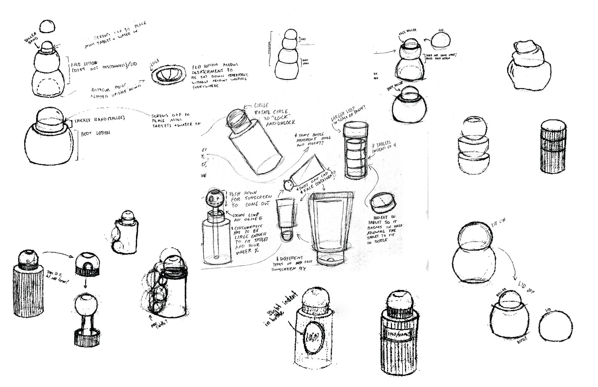
The sketches below show my early concept explorations, where I experimented with designs that improve functionality and the overall user experience.
SKETCHES
I tested the brand name in different typefaces to see which best conveyed the right tone and identity.
Exploring typefaces

The wordmark consist of clean typography and balanced spacing ensure legibility while evoking a sense of protection and ease.
wordmark Process

I chose The Seasons, a typeface that balances elegance with readability, giving the brand a contemporary but still approachable feel.
Selected typeface

I made small adjustments to the typeface, tweaking letterforms and spacing, to create a more polished, distinctive mark that feels tailored to the brand.
Final
I explored different color schemes and made slight adjustments to the form to refine the overall look. These iterations focused on improving visual branding while prioritizing the design to be approachable and functional.
ITERATION
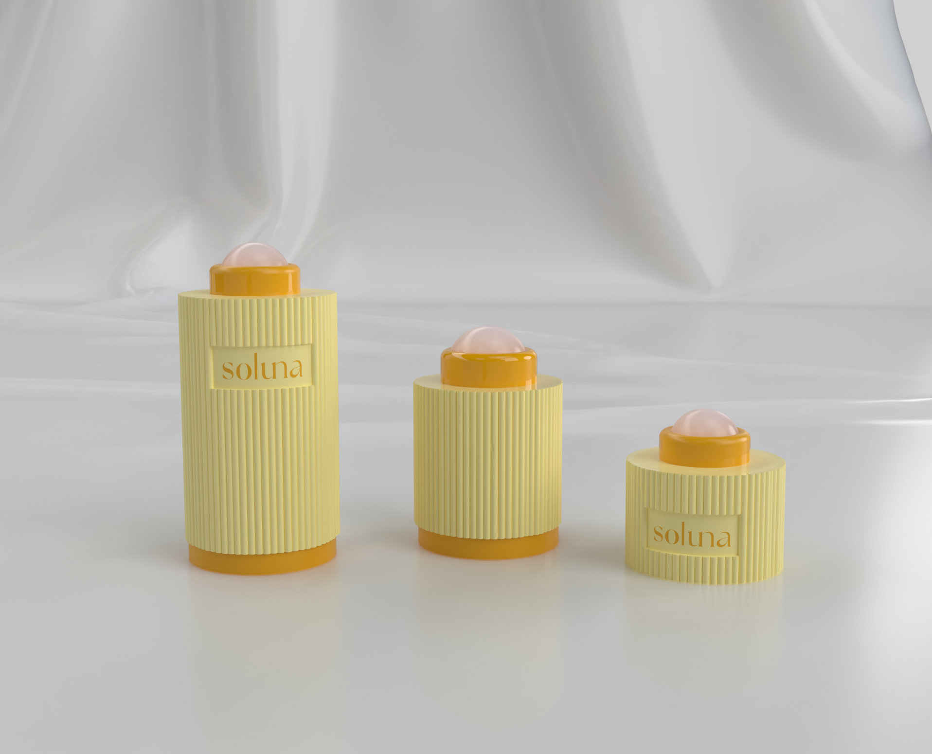


The final bottle showcases the wordmark applied to a clean, modern form, highlighting the brand’s identity. Its 2-in-1 design features dual roll-on applicators, one tailored for precise application on the face and the other for broader coverage on the body.

