To convey the rebellious spirit of snowboarding culture through expressive illustration and nostalgic design. By combining archival imagery and dynamic watercolor techniques, the project recreates 90s snowboarding aesthetics with a modern edge.
OBJECTIVE
RESEARCH

I studied over ten vintage snowboarding magazines from the 1980s to early 2000s to gain authentic insight into the culture and aesthetic of the sport. This research, along with additional analysis outlined below, helped shape the visual direction of the project.
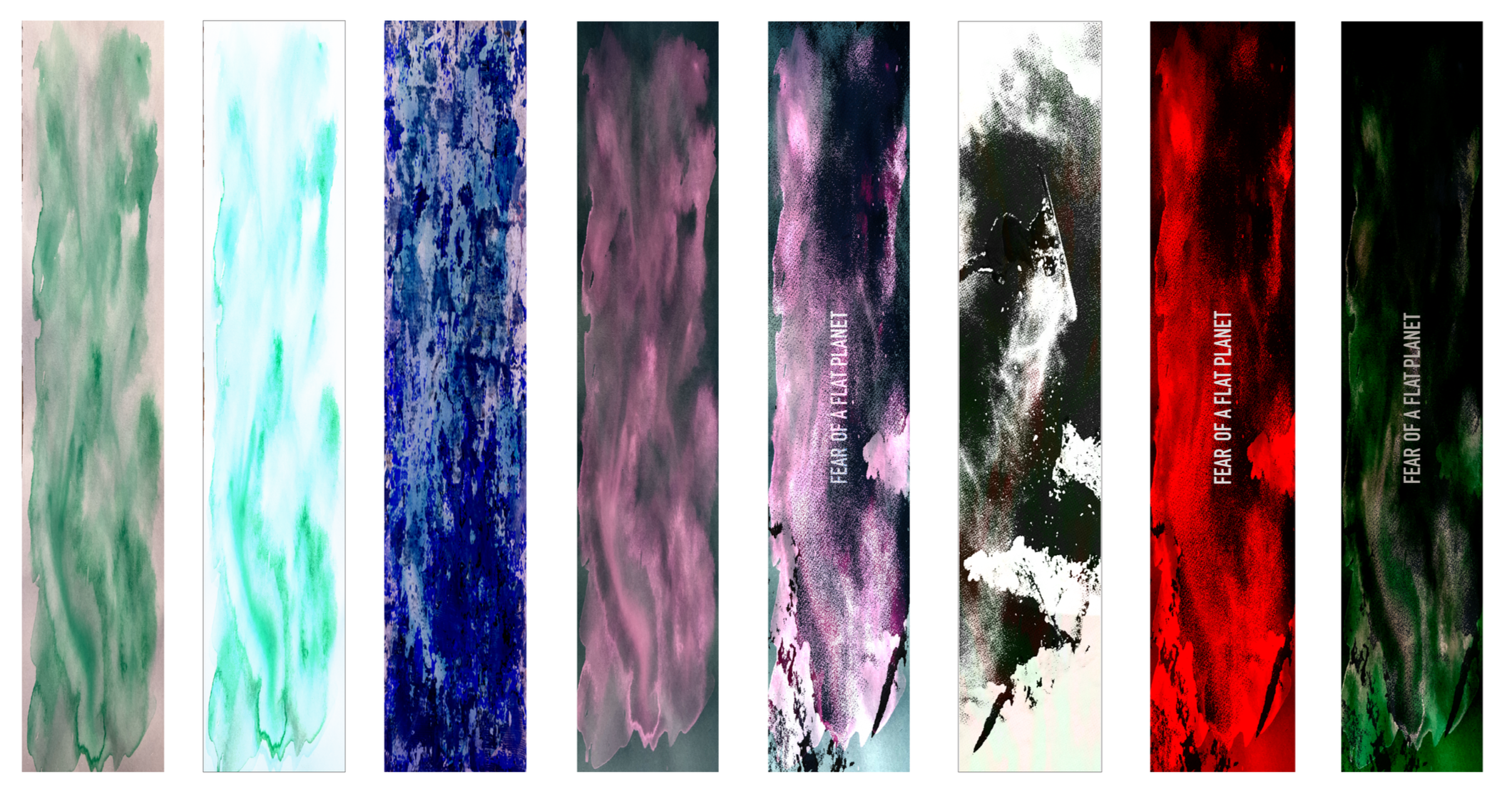
To reflect snowboarding’s spirit, I explored multiple watercolor techniques that emphasize freedom and movement. I allowed colors to flow freely to create an expressive language, mirroring the energy and spontaneity of snowboarding. Then I used the washes to create the overall composition of the board.
DESIGN EXPLORATION

I imported the watercolor washes into Photoshop and began experimenting with color variations and overlays. I layered in textures, such as halftones, while also integrating typography and imagery from the archived magazines to refine the visual direction of the composition.
Process and Iteration
COLORS AND TYPOGRAPHY
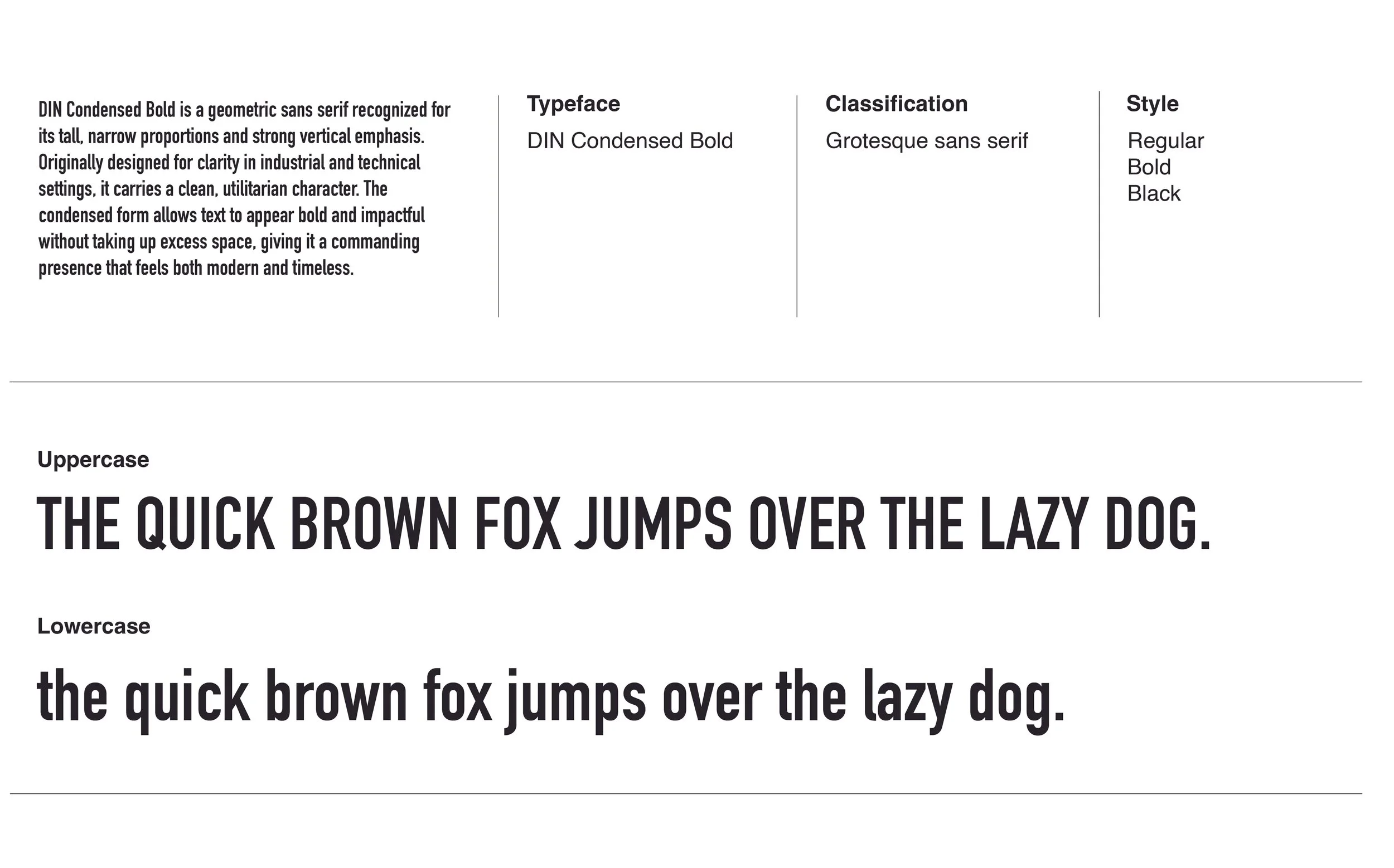
I used a triadic palette of red, purple, and green for bold contrast against the snow, paired with a sans serif typeface to capture snowboarding’s loud, energetic spirit.
typography
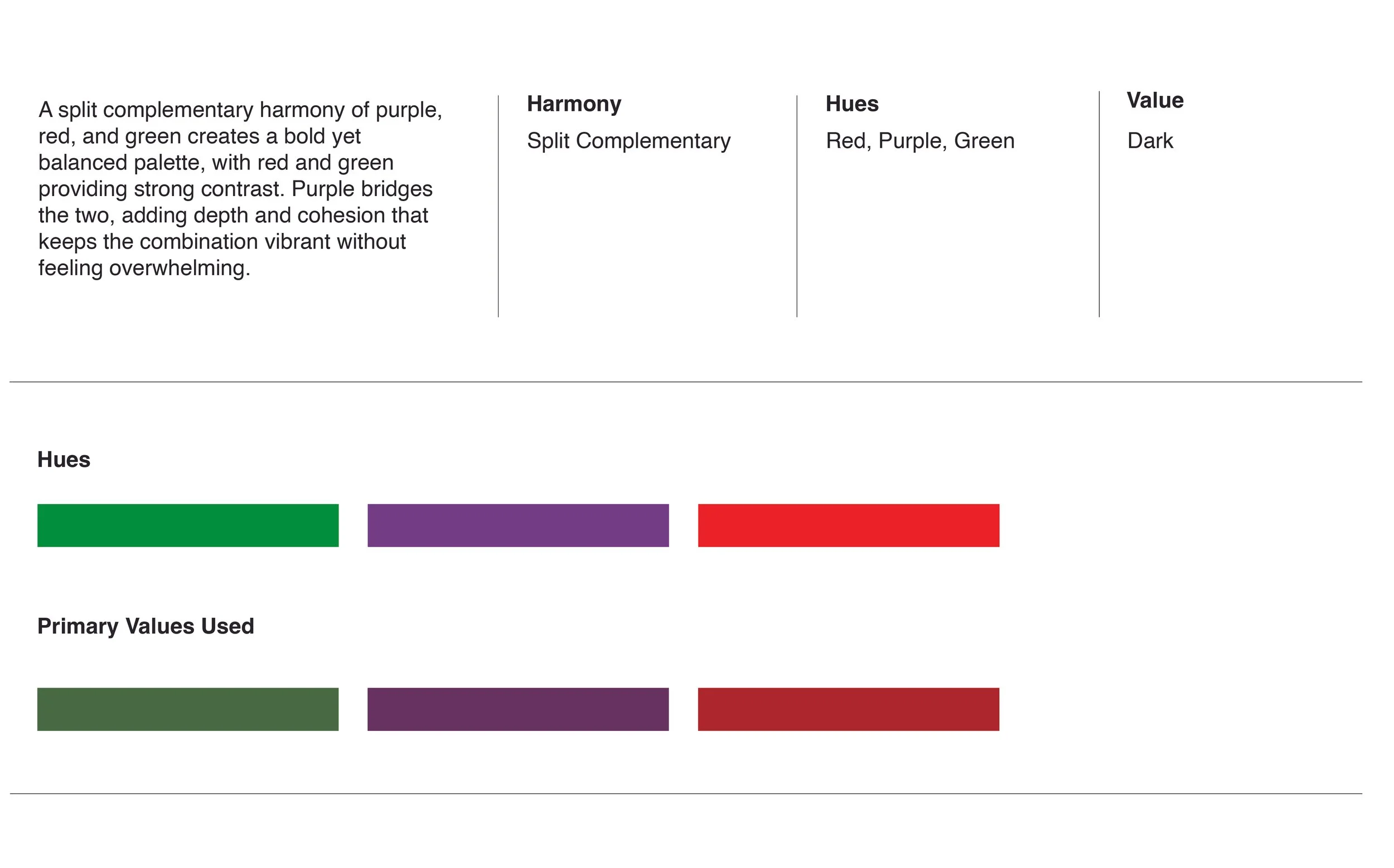
COlors
Fear of a Flat Planet captures snowboarding’s raw and expressive energy by blending archival references with bold illustration. Through layered textures and nostalgic color harmony, Fear of a Flat Planet reimagines vintage culture with a rebellious contemporary edge.


