SHELBY STRONG
CAMPAIGN WITH UNITED WAY

OBJECTIVE
The objective of United Way’s Shelby Strong campaign was to strengthen family connections across Shelby County through monthly challenges that encouraged creativity, quality time, and community engagement. To design a website that served as the central hub for details, photo submissions, and winner announcements, making participation easy and engaging for all families.

After exploring a range of sketches, I focused on one structure that best supported clarity and user flow on a mobile screen. I refined the design through several iterations, experimenting with hierarchy and spacing to create a thoughtful and engaging mark.
LOGO PROCESS
I translated my initial ideas into digital form to start shaping the visual direction. This stage allowed room for refinement while letting the core concept take root and evolve.
DIGITAL ITERATIONS
FORM AND STRUCTURE
In this phase, I refined the logo’s proportions using alignment to create visual harmony and balance.
Here, the client selected their preferred direction, the green and orange mark, confident in its balance and alignment with their vision.
FINAL
I designed the mobile layout with a focus on accessibility and ease of navigation. Each element was thoughtfully placed to result in a smooth user experience, while maintaining the campaign’s friendly tone.
UX UI-iPHONE

I began the website design by sketching a few rough layout ideas for the iPhone screen. This helped me explore structure, flow, and how users might interact with main elements on a smaller device.
SKETCH EXPLORATION
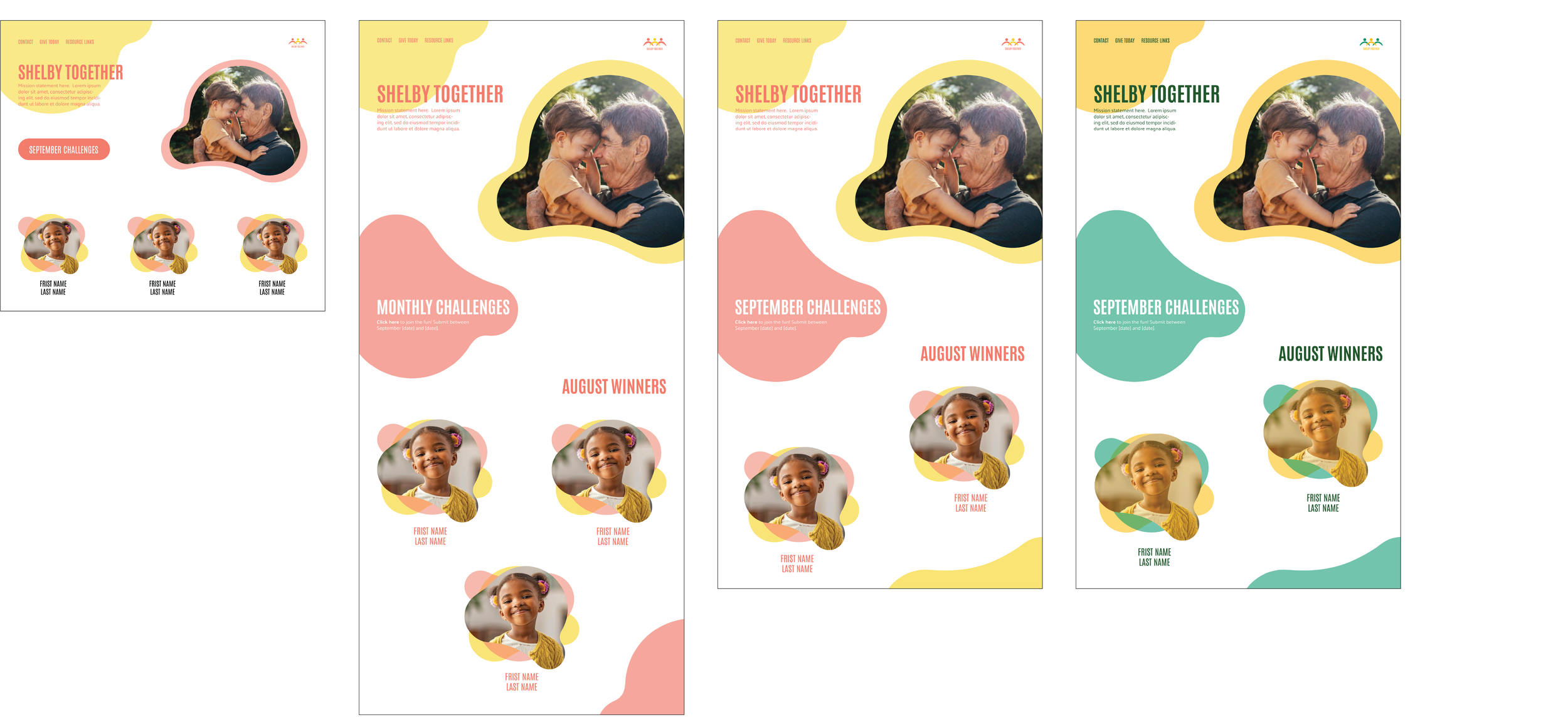
DIGITAL ITERATIONS

I translated my initial ideas into digital form to start shaping the visual direction. This stage allowed room for refinement while letting the core concept take root and begin to evolve.
I concluded with one final layout structure, refined for clarity, usability, and visual flow. The design was presented in two color harmonies, giving the client the opportunity to select the direction.
FINAL


The desktop layout was designed to be accessible and easy to navigate. Visual elements reinforce the message of unity while keeping the experience engaging and functional for users.
UX UI-DESKTOP
I refined layout structure, typography, and visual hierarchy based on feedback and usability goals. Multiple iterations were explored to ensure the design felt both engaging and easy to navigate.
DIGITAL ITERATIONS
The final design brings together a clean, welcoming interface with clear navigation and community focused visuals. It effectively guides users through the website.
FINAL DESKTOP

FINAL
Shelby Strong is set to launch in January 2026.

